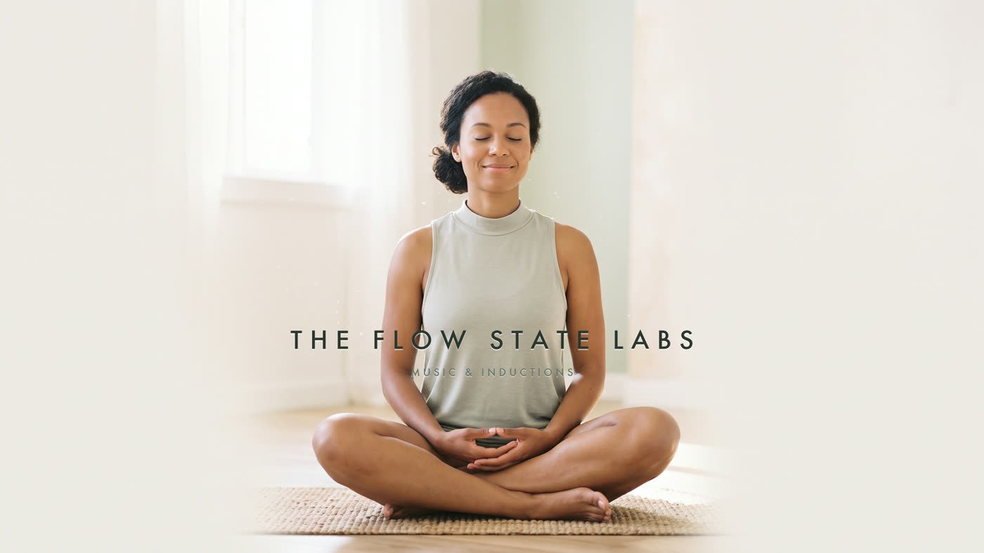
A wellness label with a catalogue of sound and no way to hold it. We built the identity,
the palette, the mark and a full product range — mats, ceramics, apparel and carry —
so a listening brand could become a living one.
ClientThe Flow State Labs
ScopeIdentity, art direction, product
Year2026
Objects for the part of the day you keep for yourself.
One light. One surface. One quiet system.
The problem
A brand you could hear, but couldn't hold.
The Flow State Labs had built an audience around music and guided inductions — a genuinely
calm thing in a loud category. But the brand existed only as sound and thumbnails. There was
no palette that survived off-screen, no mark that worked at 16 pixels or embroidered on a
chest, and nothing a listener could actually own.
What already existed
Four minutes of proof that the brand had a feeling.
The film came first. Everything we designed afterwards — the mark, the palette, the
tracking — was reverse-engineered from the way this already made people feel.
Shown here without sound.
Trigger v1 — “Low Tone Flow”. Audio removed for this page.
Motion studies
Twelve loops. One temperature.
A library of slow visual loops built for the catalogue — ink in water, cloud seas, rain
on glass. They set the pace the whole identity had to match: nothing cuts, nothing hurries.
Ink bloomCloud seaFog pinesStill lakeRain glassCavern pool
Channel identity
The light route, chosen over the dark one.
Two directions were built and tested — one deep and smoke-toned, one full of morning
light. The light route won: it looked like the feeling after the practice rather than
the state you arrive in.
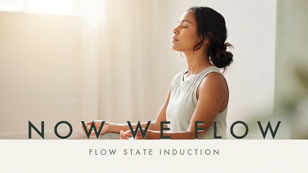
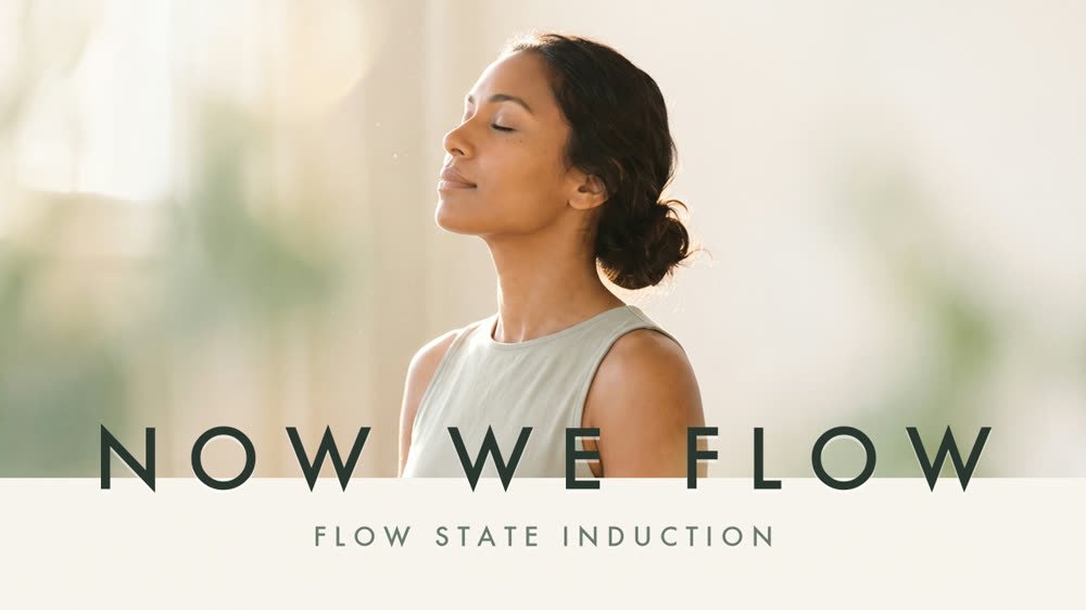
Channel bannerThumbnail — Now We FlowThumbnail — Flow State InductionAvatar
The mark
Three lines of moving water.
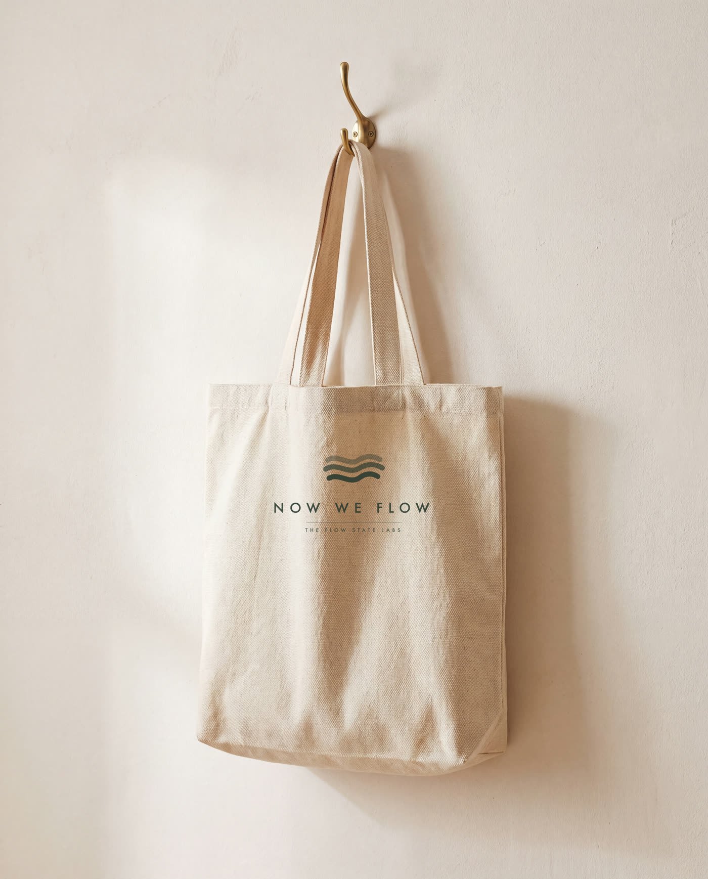
Drawn as pure vector with no type inside it, weighted front to back so it reads as depth
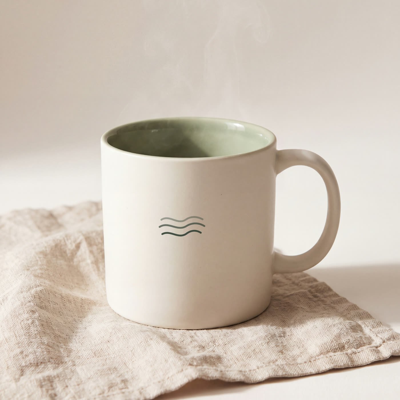
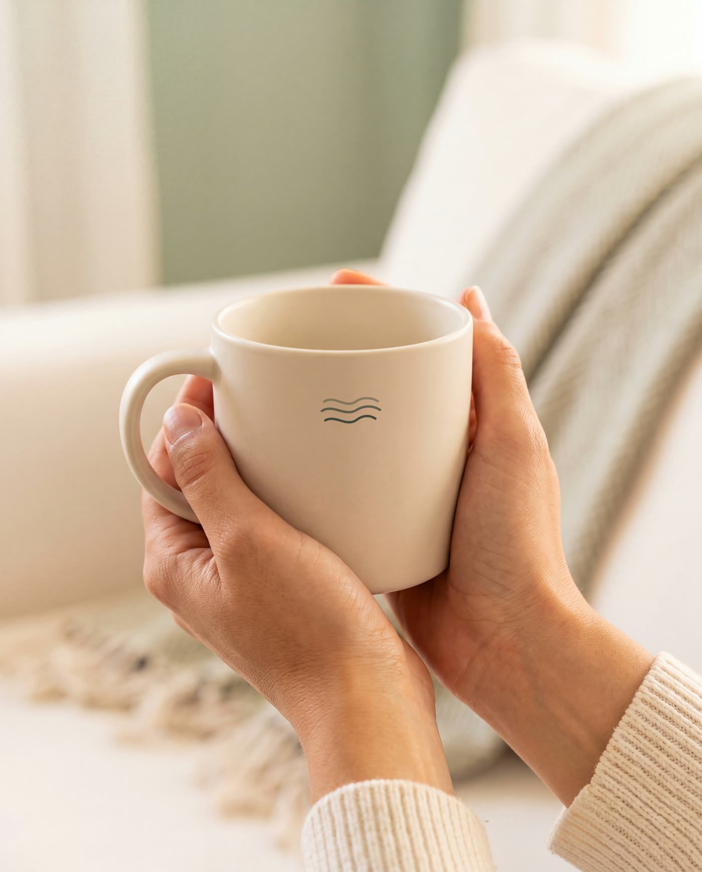
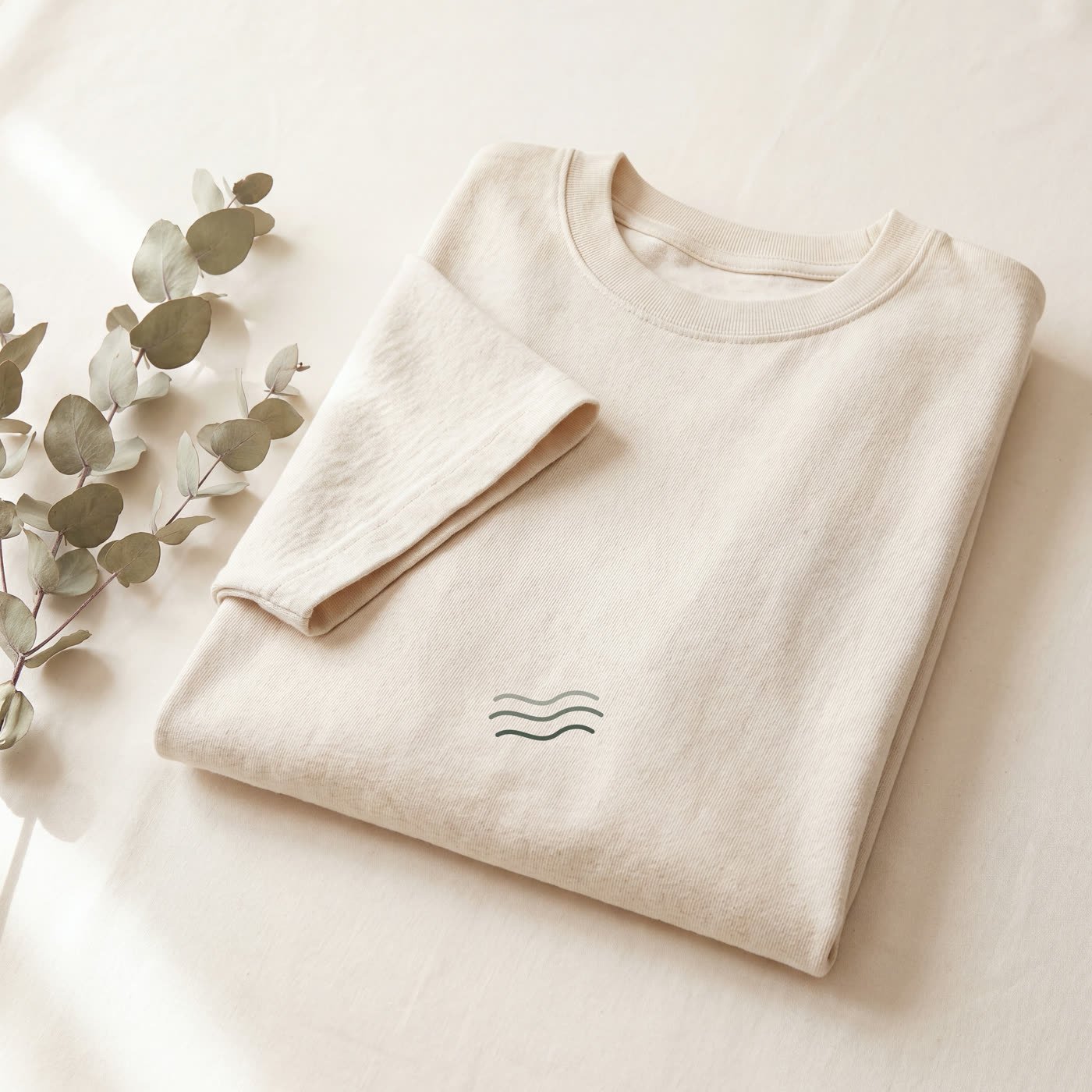
rather than pattern. It debosses into ceramic, embroiders onto heavy cotton, and still
holds its shape as a favicon.
Forest on Bone
Reversed
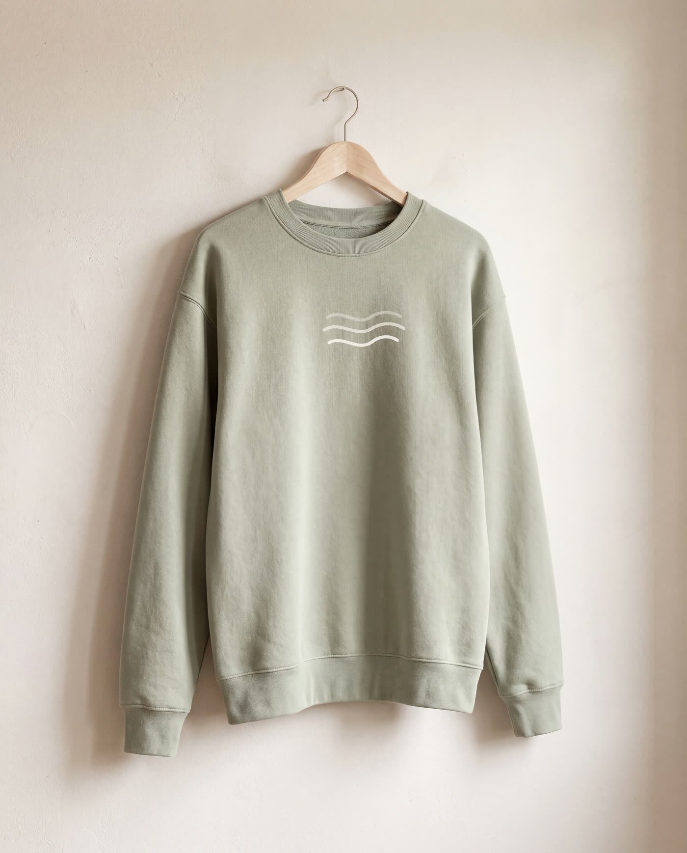
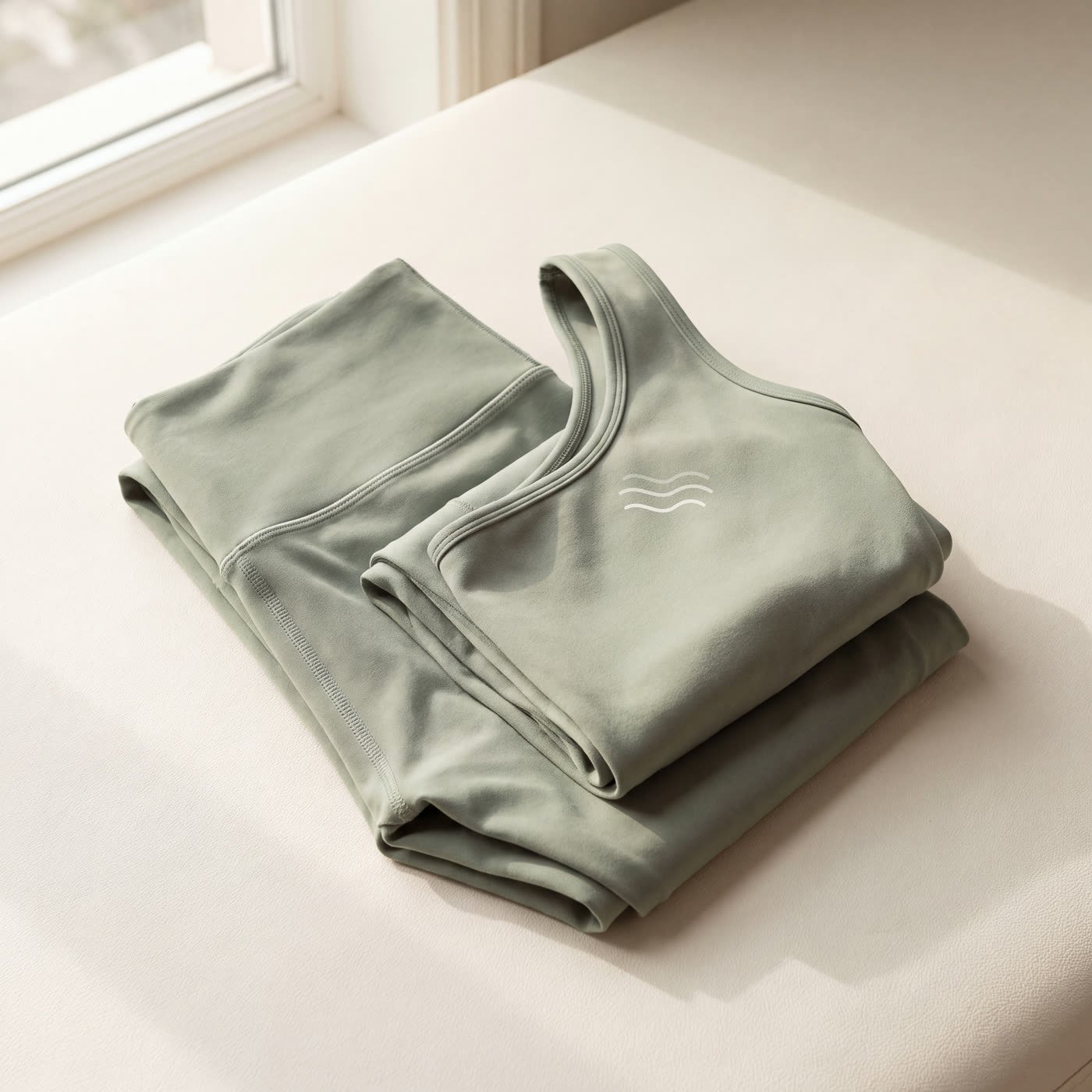
On apparel
The palette
Morning light on linen.
Eight values, pulled from the light in the brand's own photography. Every one carries its
measured contrast ratio, so nobody downstream has to guess which greens can hold text.
Warm White#FBF9F5
Bone#F5F1EA
Mist#E7E3DA
Sage#B7C3AE
Sage Deep#8D9C84
Moss#5F6E58
Forest#2A3A2F
Oat#D9C7A9
The range
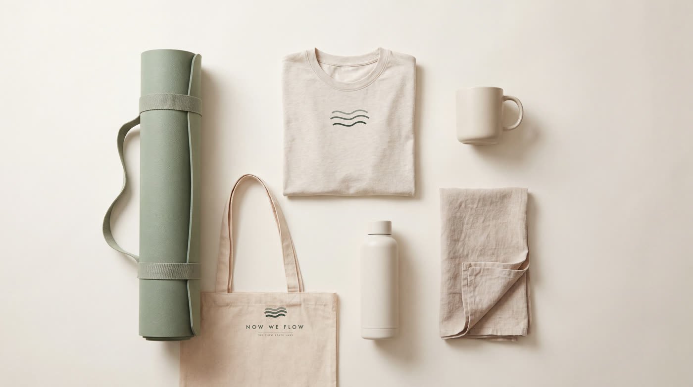
Ten pieces, one light.
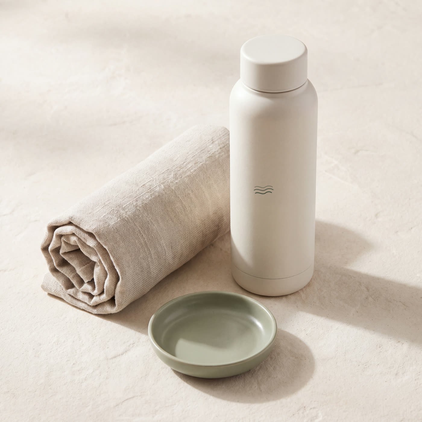
Every shot on the same warm white ground under the same soft indirect daylight, so the
catalogue reads as one system rather than ten separate product pages.
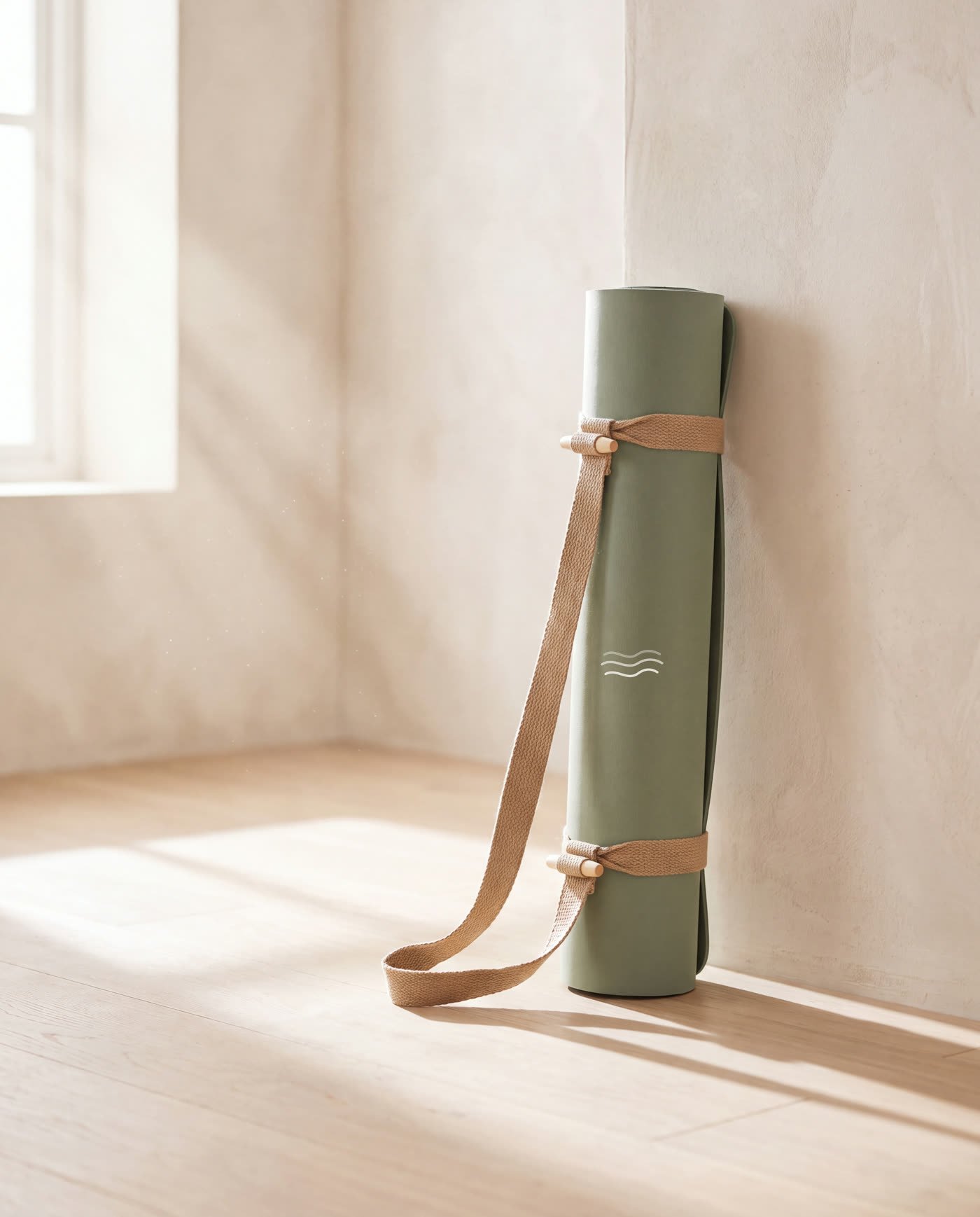
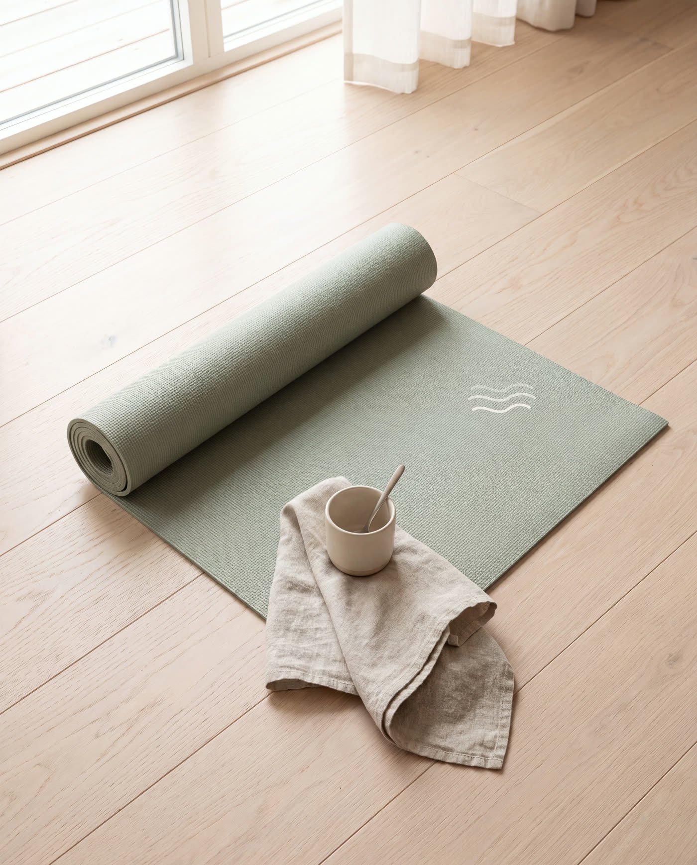
The full rangeMat — rolled, jute strapMat — laidStoneware mug, sage glazeIn useHeavyweight sweatshirtCotton teeActivewear setCanvas toteBottle, towel and dish
The type
Tracking wide enough to slow you down.
The signature of the identity isn't the typeface, it's the space between the letters.
At 0.42em the eye can't sprint across a word — which is the entire point of the brand.
NOW WE FLOW
THE FLOW STATE LABS
Want this for your brand?
Fifteen minutes, and you'll know whether your identity is helping you sell or quietly
costing you. No pitch deck.